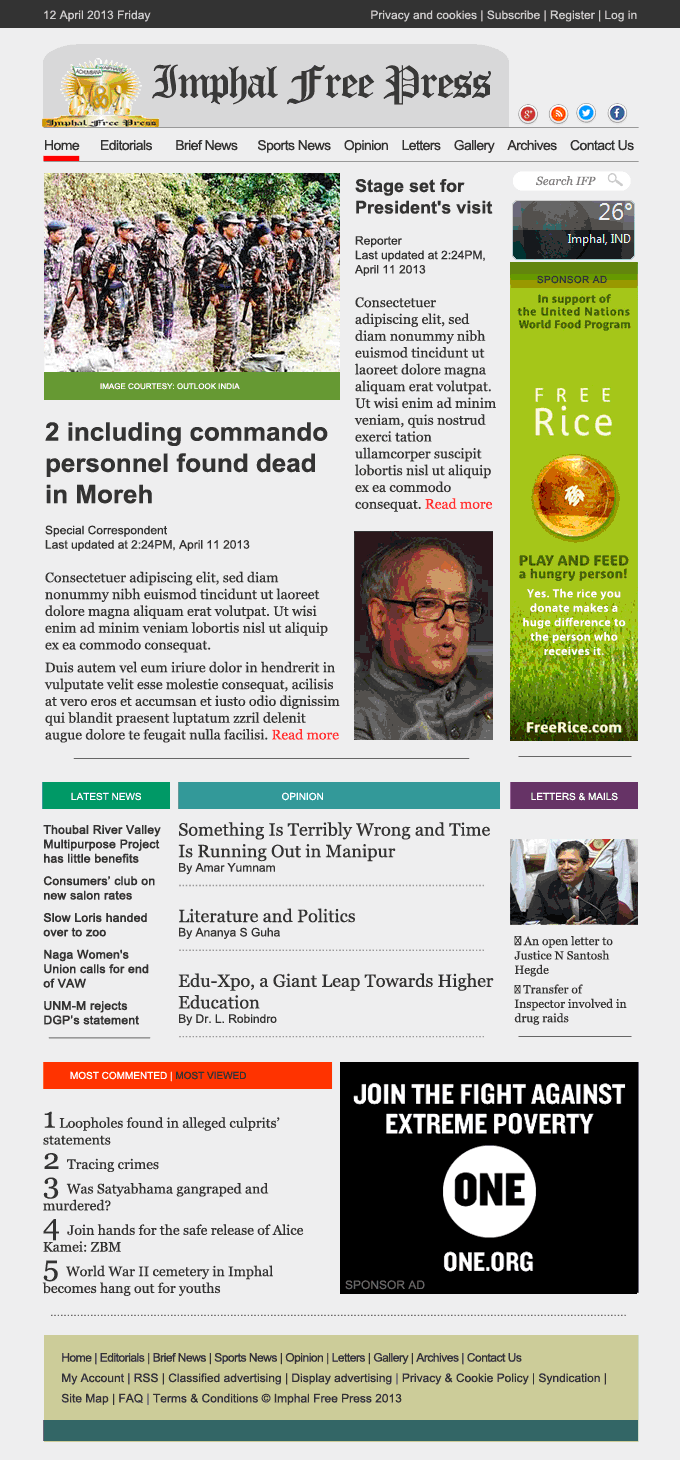
Uninvited design # 1 Imphal Free Press
The professionals web designers and developers must have put extra effort to make the sites look appealing as much as they would have done to enhance the functional qualities. I would not demean them or their work. It is just a perspective of certain flaws on particular sites and a way in which I would like to alter them.
I am an ardent believer of minimalism but I stick lack that touch to make a work look beautiful with less. Perhaps, I should start with my favourite things, just like having only very small pegs of whisky, instead of pouring a quarter at one go.
In a very apolitical term, I would quote RB Fuller, who considers, “You never change things by fighting the existing reality. To change something, build a new model that makes the existing model obsolete.”
You might want to read the vile design attack!
A Design Review of Newspapers' Websites Based in Imphal
Uninvited design # 1 Imphal Free Press


Comments
Post a Comment