Typography Is Rock n’ Roll
🎸 Contents
Introduction
Many rock n’ roll bands have unique wordmarks or logos for their names. These tell a lot of tales about design, typography, pop culture and even capitalism. Read the story, and check out the bands, find out the names of the typefaces, and look at the titbits about each design.
It is! The ELO sings Rock n’ Roll Is King, and here you will find typography is rock n' roll.
Looking back, I realise I had been more in love with typefaces than with some of the rock n’ roll bands.
Iron Maiden, for example, was never my type despite the fact that I grew up as a hardcore metal fan and that I'd fabric-paint its wordmarks on T-shirts.
Of course, I do dig Bruce Dickinson’s vocals and can relate to 22 Acacia Avenue memes.
I have been more into the triumvirate of Black Sabbath, Led Zeppelin and Deep Purple—that is, the more classic metal bands.
But all of them also have a similarity other than their era-defining, genre-defying music: All of them have cool wordmarks for their names.
Strike Up the Band
In a normal world, anybody can easily recognise the Metallica’s all-cap, bold-black name with an elongated M and A that resemble flashlights and perfectly balance the design just as Kirk Hammett’s riffs would harmonise James Hetfield’s low baritone.
Metallica had tried once to rebrand themselves with a new, visibly different wordmark when they released Load in 1996.
They had used this new style for Reload (1997) and then another one for St. Anger (2003). But their ubiquitous original design got back with Death Magnetic in 2008.
All the wordmarks, band names, logos; call it by different names, the design is just brilliant.
There is already melody in music and when design complements it, then suddenly—to speak the language of the world of memes—hope in humanity is restored!
Some of them are so powerful, not in its visual representation but in terms of impact and impression that new typefaces have been created, for instance, the Floydian typeface, which is available on Dafont website.
This also reminds me of a meme referenced on The Dark Side of the Moon.
Apparently, June is also the Pride Month.
 |
| Image from knowyourmeme.com |
When the Band Begins to Play
Until a decade ago, the American music and film industry dominate the contemporary pop culture.
It has been no different in the rock n’ roll front.
If we have to trace its history, we will be going through the evolution of music of the American Black people.
With reference to design and typography in particular, the trend of writing names in cool typefaces started only with the rise of music that we know as rock n’ roll today.
It is worth mentioning here that a few British bands did play a crucial role.
Some puritans would be offended with the inclusion of a band like The Beatles in any category under rock n’ roll on the ground that it was a pop band.
Nevertheless, from comparative historical perspectives we can include it.
And the point is that The Beatles was one of the first non-American bands that branded itself with a recognisable wordmark.
And yes, it was definitely the real rock n’ roll bands that mix music and design, and set the trend from the Sixties onwards.
As much as there has been a harmony out of these creative worlds of music and design, we cannot also ignore the fact that design, in this context, is closely related to capitalism.
In simple words, a logo is used for easy identification, branding, to stand out from the crowd and what not.
It is used for selling things. For profit.
Likewise, the rock n’ roll bands have a tendency to become mere products that can be bought, consumed and discarded.
However, this is not confined to rock n’ roll.
Rather it is prevalent in the world of pop culture and its very products.
As a matter of fact that is what pop is. Use it and throw it away.
For anything pop, everything has to be mass produced, while manufacturing conformity and reducing the number of unique ideas.
On this basis, the names in the form of, again, wordmarks and logos, can invite bad press.
Otherwise, in arts, creativity, music and design, more hopes in humanity are always restored when people create innovative style and form.
Do you love typography?
- I Love Typography: So you want to create a font: Part 1
- I Love Typography: So you want to create a font: Part 2
- Butterick’s Practical Typography, 2nd Edition
- Typewolf, What's Trending in Type
- Incredible Types, a curated collection and showcase of outstanding typography and design
- Download typefaces and fonts of your choice, dafont.com
Band Together
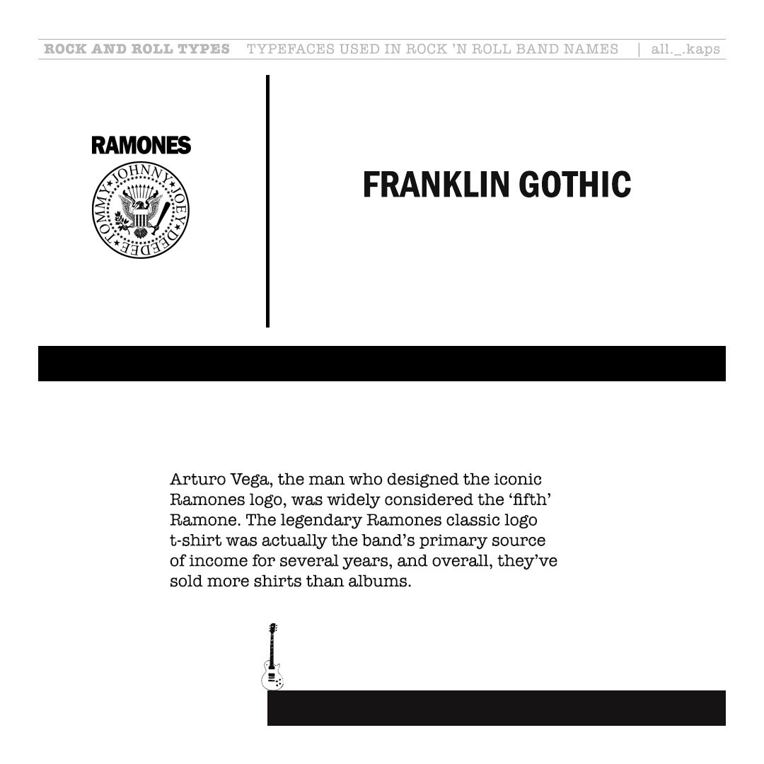
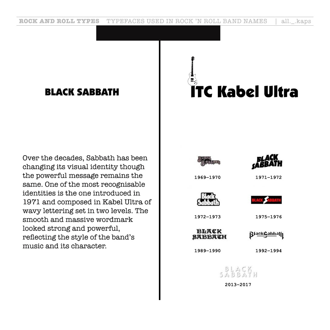
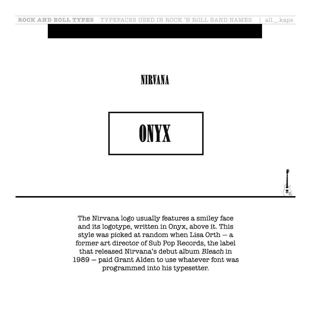
This collection of Rock and Roll Types: Typography Is Rock n’ Roll is visually incomplete because I have not included many other bands.
These were originally created as a slide/pics for Instagram, which allows only ten at a time.
Some notable mentions must include, besides the names in the last image, Twister Sisters, Van Halen, Queen, Nine Inch Nails, Def Leppard, Judas Priest, Slayer, Ozzy Osbourne, The Who, Dead Kennedys, The Doors and Whitesnake.
Let me know if you want a slide for any band!
Rock n’ Roll Types
You Can Read More Write-ups on Music here:
- Check all the posts on TYPOGRAPHY on this blog


Slot Machines & Casinos - JM Hub
ReplyDeleteJumba Casino is one of the best online 상주 출장마사지 casino and gaming companies 김제 출장마사지 in the South Africa market and has since developed 원주 출장안마 into the 충주 출장마사지 leading provider of 통영 출장마사지 fun and